Html: CSS 字体单位:px、em、rem 和 %
对于绘图和印刷而言,「单位」很相当重要的,然而在网页排版里,单位也是同样具有重要性,在 CSS3 普及以来,更支持了一些方便好用的单位 ( px、em、rem...等 ),这篇文章将整理这些常用的 CSS 单位,也帮助自己未来在使用上能更加得心应手。
若要把单位做区隔,最简单可以分为「网页」和「印刷」两大类,通常对于 CSS 来说只会应用到网页的样式,毕竟真正要做印刷,还是会倾向透过排版软件来进行设计。
网页 ( 单位 )
- px:绝对单位,代表屏幕中每个「点」( pixel )。
- em:相对单位,每个子元素透过「倍数」乘以父元素的 px 值。
- rem:相对单位,每个元素透过「倍数」乘以根元素的 px 值。
- %:相对单位,每个子元素透过「百分比」乘以父元素的 px 值。
网页 ( 属性名称 )
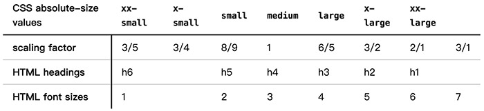
- medium:默认值,等于 16px ( h4 默认值 )
- xx-small:medium 的 0.6 倍 ( h6 默认值 )
- x-small:medium 的 0.75 倍
- small:medium 的 0.8 倍 ( h5 默认值,W3C 定义为 0.89,实测约为 0.8 )
- large:medium 的 1.1 倍 ( h3 默认值,W3C 定义为 1.2,实测约为 1.1 )
- x-large:medium 的 1.5 倍 ( h2 默认值 )
- xx-large:medium 的 2 倍 ( h1 默认值 )
- smaller:约为父层的 80%
- larger:约为父层的 120%
印刷
- pt:打印机的每个「点」,定义为 1 pt = 1/72 in,如果在 72 dpi 的系统上 1 px = 1 pt,但如果在 96 dpi 的系统上 1 px = 0.75 pt ( 72/96 = 0.75 )。
- in:英吋,在 96 dpi 的系统上 1 in = 96 px。
- cm:公分,在 96 dpi 的系统上 1 cm = 37.795275593333 px。
- mm:公厘,在 96 dpi 的系统上 1 cm = 3.7795275593333 px。
范例展示
以下将展示四种不同单位的范例,为公平起见,四个范例都套用默认的 div 格式,纯粹改变font-size看看有何不同,由于子元素若没有设定 font-size,会自动继承父元素的 font-size,使用上就应该要预先初始化字体大小,下面这两段 CSS 可以将所有的元素字体大小默认为 16px,尔后亦可个别进行调整。
html{
    font-size:16px;
}

html * {
    font-size: 1rem;
}
1. px
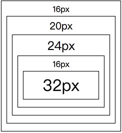
px 是绝对单位,因此只要设定多少 px,就会精确的呈现,对于一些讲求精准位置的排版而言十分有用,如范例表示的,指定多大 px 字体就会多大。
<div style="font-size:16px;">16px
    <div style="font-size:20px;">20px
        <div style="font-size:24px;">24px
            <div style="font-size:16px;">16px
                <div style="font-size:32px;">32px</div>
            </div>
        </div>
    </div>
</div>
2. em
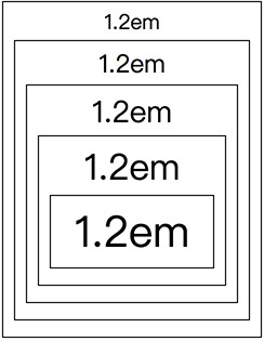
em 是相对单位,为每个子元素透过「倍数」乘以父元素的 px 值,如果我们每一层 div 都使用 1.2em,最内层就会是16px x 1.2 x 1.2 x 1.2 x 1.2 x 1.2 = 39.8px。( 浏览器默认字体大小为 16px,若无特别指定则会直接继承父元素字体大小 )
<div style="font-size:1.2em;">1.2em
    <div style="font-size:1.2em;">1.2em
        <div style="font-size:1.2em;">1.2em
            <div style="font-size:1.2em;">1.2em
                <div style="font-size:1.2em;">1.2em</div>
            </div>
        </div>
    </div>
</div>
3. rem
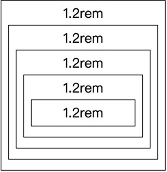
rem 是相对单位,为每个元素透过「倍数」乘以根元素的 px 值,如果我们每一层 div 都使用 1.2rem,最内层就会是16px x 1.2 = 19.2px。( 根元素指的是 html 的 font-size,预设为 16px )。
<div style="font-size:1.2rem;">1.2rem
    <div style="font-size:1.2rem;">1.2rem
        <div style="font-size:1.2rem;">1.2rem
            <div style="font-size:1.2rem;">1.2rem
                <div style="font-size:1.2rem;">1.2rem</div>
            </div>
        </div>
    </div>
</div>
4. %
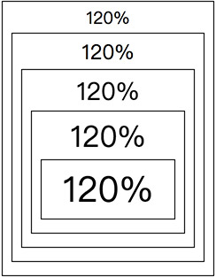
% 百分比是相对单位,和 em 大同小异,简单来说 em 就是百分比除以一百,如果我们每一层 div 都使用 120%,就等同于 1.2em,最内层就会是16px x 1.2 x 1.2 x 1.2 x 1.2 x 1.2 = 39.8px。
<div style="font-size:120%;">120%
    <div style="font-size:120%;">120%
        <div style="font-size:120%;">120%
            <div style="font-size:120%;">120%
                <div style="font-size:120%;">120%</div>
            </div>
        </div>
    </div>
</div>
5. small、medium、large...等
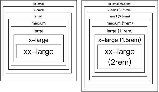
字体大小的属性有七种,分别是 xx-small、x-small、small、medium、large、x-large 和 xx-large,除了 x-small,其余六种分别对应 h6~h1 的卷标文字大小,根据 W3C 的规范,以 medium 预设 16px 为基础 ( 若 html 字体默认大小改变,medium 也会跟着变 ),使用固定的百分比乘以 medium 的大小,例如 ss-small 预设为16px x 0.6 = 9.6px ( 浏览器显示为 12px )。
<div style="font-size:xx-small;">xx-small
    <div style="font-size:x-small;">x-small
        <div style="font-size:small;">small
            <div style="font-size:medium;">medium
                <div style="font-size:large;">large
                    <div style="font-size:x-large;">x-large
                        <div style="font-size:xx-large;">xx-large</div>
                    </div>
                </div>
            </div>
        </div>
    </div>
</div>
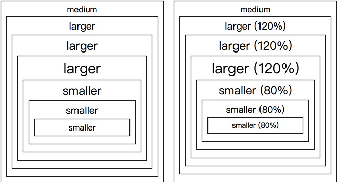
6. larger、smaller
larger 和 smaller 就是固定百分比为单位,larger 为父层的 120%,smaller 为父层的 80%。
<div style="font-size:medium;">medium
  <div style="font-size:larger;">larger
    <div style="font-size:larger;">larger
      <div style="font-size:larger;">larger
        <div style="font-size:smaller;">smaller
          <div style="font-size:smaller;">smaller
            <div style="font-size:smaller;">smaller</div>
          </div>
        </div>
      </div>
    </div>
  </div>
</div>
范例展示
范例展示 1:px、em、rem 和 %

<!DOCTYPE html>
<html lang="zh">
<head>
  <meta charset="UTF-8">
  <meta name="author" content="oxxo.studio">
  <meta name="copyright" content="oxxo.studio">
  <title>范例展示 1:px、em、rem 和 %</title>
  <style>
    html,
    body {
      height: 100%;
      width: 100%;
      margin: 0;
      padding: 0;
    }
    html{
      font-size:16px;
    }
    html * {
      font-size: 1rem;
    }
    #demo div {
      border: 1px solid #000;
      padding: 5px 10px;
      margin: 3px 0 10px;
      width: 100%;
      max-width: 240px;
      box-sizing: border-box;
      text-align: center;
    }
    #demo>div {
      margin: 10px;
      float:left;
    }
  </style>
</head>
<body>
  <div id="demo">
    <div style="font-size:16px;">16px
      <div style="font-size:20px;">20px
        <div style="font-size:24px;">24px
          <div style="font-size:16px;">16px
            <div style="font-size:32px;">32px</div>
          </div>
        </div>
      </div>
    </div>
    <div style="font-size:1.2em;">1.2em
      <div style="font-size:1.2em;">1.2em
        <div style="font-size:1.2em;">1.2em
          <div style="font-size:1.2em;">1.2em
            <div style="font-size:1.2em;">1.2em</div>
          </div>
        </div>
      </div>
    </div>
    <div style="font-size:1.2rem;">1.2rem
      <div style="font-size:1.2rem;">1.2rem
        <div style="font-size:1.2rem;">1.2rem
          <div style="font-size:1.2rem;">1.2rem
            <div style="font-size:1.2rem;">1.2rem</div>
          </div>
        </div>
      </div>
    </div>
    <div style="font-size:120%;">120%
      <div style="font-size:120%;">120%
        <div style="font-size:120%;">120%
          <div style="font-size:120%;">120%
            <div style="font-size:120%;">120%</div>
          </div>
        </div>
      </div>
    </div>
  </div>
</body>
</html>
范例展示 2:large、small、medium...等

<!DOCTYPE html>
<html lang="zh">
<head>
  <meta charset="UTF-8">
  <meta name="author" content="oxxo.studio">
  <meta name="copyright" content="oxxo.studio">
  <title>范例展示 2:large、small、medium...等</title>
  <style>
    html,
    body {
      height: 100%;
      width: 100%;
      margin: 0;
      padding: 0;
    }
    body {
      padding-bottom: 200px;
    }
    html {
      font-size: 16px;
    }
    html * {
      font-size: 1rem;
    }
    #demo div {
      border: 1px solid #000;
      padding: 5px 10px;
      margin: 3px 0 10px;
      width: 100%;
      max-width: 320px;
      box-sizing: border-box;
      text-align: center;
    }
    #demo>div {
      margin: 10px;
      float: left;
    }
  </style>
</head>
<body>
  <div id="demo">
    <div style="font-size:xx-small;">xx-small
      <div style="font-size:x-small;">x-small
        <div style="font-size:small;">small
          <div style="font-size:medium;">medium
            <div style="font-size:large;">large
              <div style="font-size:x-large;">x-large
                <div style="font-size:xx-large;">xx-large</div>
              </div>
            </div>
          </div>
        </div>
      </div>
    </div>
    <div style="font-size:0.6rem;">xx-small (0.6rem)
      <div style="font-size:0.75rem;">x-small (0.75rem)
        <div style="font-size:0.8rem;">small (0.8rem)
          <div style="font-size:1rem;">medium (1rem)
            <div style="font-size:1.1rem;">large (1.1rem)
              <div style="font-size:1.5rem;">x-large (1.5rem)
                <div style="font-size:2rem;">xx-large (2rem)</div>
              </div>
            </div>
          </div>
        </div>
      </div>
    </div>
    <div style="clear:both; border:none; width:1px; margin:0; padding:0;"></div>
    <div style="font-size:medium;">medium
      <div style="font-size:larger;">larger
        <div style="font-size:larger;">larger
          <div style="font-size:larger;">larger
            <div style="font-size:smaller;">smaller
              <div style="font-size:smaller;">smaller
                <div style="font-size:smaller;">smaller</div>
              </div>
            </div>
          </div>
        </div>
      </div>
    </div>
    <div style="font-size:16px;">medium
      <div style="font-size:120%;">larger (120%)
        <div style="font-size:120%;">larger (120%)
          <div style="font-size:120%;">larger (120%)
            <div style="font-size:80%;">smaller (80%)
              <div style="font-size:80%;">smaller (80%)
                <div style="font-size:80%;">smaller (80%)</div>
              </div>
            </div>
          </div>
        </div>
      </div>
    </div>
  </div>
</body>
</html>
小结
熟悉了字体大小单位之后,就更能有系统的设计整个网站的 CSS 架构,不过 font-size 本身和 font-family 有着一些复杂的关系,不同的 font-family 有时也会影响 font-size 的设定,因此使用上还是得稍微注意一下!